 前端里
前端里通过 CSS3 的新特性,我们创作出好的交互和效果的可能性大大增加。这篇文章中,我想与大家分享一些 CSS3 动画按钮效果。我们的想法是创建一个具有不同风格的一些动画链接元素,鼠标悬停时有动画效果和活动状态。

HTML 示例代码:
<a href="#" class="a-btn"> <span class="a-btn-slide-text">$29</span> <img src="images/icons/1.png" alt="Photos" /> <span class="a-btn-text"><small>Available on the Apple</small> App Store</span> <span class="a-btn-icon-right"><span></span></span> </a>
CSS 示例代码:
.a-btn{ background: linear-gradient(top, #a9db80 0%,#96c56f 100%); padding-left: 90px; padding-right: 105px; height: 90px; display: inline-block; position: relative; border: 1px solid #80ab5d; box-shadow: 0px 1px 1px rgba(255,255,255,0.8) inset, 1px 1px 3px rgba(0,0,0,0.2); border-radius: 4px; float: left; clear: both; margin: 10px 0px; overflow: hidden; transition: box-shadow 0.3s ease-in-out; } .a-btn img{ position: absolute; left: 15px; top: 13px; border: none; transition: all 0.3s ease-in-out; } .a-btn .a-btn-slide-text{ position: absolute; font-size: 36px; top: 18px; left: 18px; color: #6d954e; opacity: 0; text-shadow: 0px 1px 1px rgba(255,255,255,0.4); transition: opacity 0.2s ease-in-out; } .a-btn-text{ padding-top: 13px; display: block; font-size: 30px; text-shadow: 0px -1px 1px #80ab5d; } .a-btn-text small{ display: block; font-size: 11px; letter-spacing: 1px; } .a-btn-icon-right{ position: absolute; right: 0px; top: 0px; height: 100%; width: 80px; border-left: 1px solid #80ab5d; box-shadow: 1px 0px 1px rgba(255,255,255,0.4) inset; } .a-btn-icon-right span{ width: 38px; height: 38px; opacity: 0.7; border-radius: 20px; position: absolute; left: 50%; top: 50%; margin: -20px 0px 0px -20px; border: 1px solid rgba(0,0,0,0.5); background: #4e5c50 url(../images/arrow_down.png) no-repeat center center; box-shadow: 0px 1px 1px rgba(255,255,255,0.3) inset, 0px 1px 2px rgba(255,255,255,0.5); transition: all 0.3s ease-in-out; }
您可能感兴趣的相关文章

 实现移动端Retina屏幕1px边框的7种方法
 Scrollanim – CSS3 & JavaScript 创建滚动动画
 一组网页边栏过渡动画【附源码下载】
 35个让人惊讶的 CSS3 动画效果演示
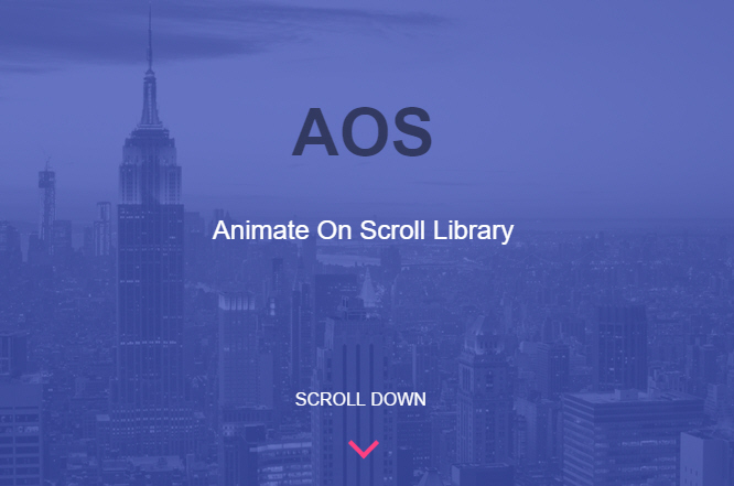 AOS – 另外一个独特的页面滚动动画库(CSS3)